Story Points as Categorical Data: Embracing the Cone of Uncertainty
By Andy Carlberg | Published on 12/11/2025
Introduction
Points are one of the most misunderstood parts of any Scrum-like Agile process and are often a stumbling block for teams new to Agile. It’s often referred to as a level of complexity, but this description is vague and confusing when you don’t have experience (and, for some, even when you do). Naturally, we want to estimate in time - “How long will this task take?”
Scrum and similar agile processes use points to address a specific concern, but the intentional ambiguity of Points makes them confusing for teams that have been working with time estimates up to this point. This fundamental misunderstanding comes from the false quantitative nature of the Point value.
The core of the issue is this: Story Points are fundamentally categorical data - labels of relative size - that we incorrectly treat as quantitative, interval data for calculating velocity. We should think of Points as qualitative, categorical data to grasp the true intent and why, when visualized correctly, they reveal the inherent size-specific Cone of Uncertainty within your team’s historical performance.
Why Points at All? The Tension Between Categories and Numbers
The origin of Points is somewhat up for debate but Ron Jeffries (of Extreme Programming fame) has tentatively laid claim to coining the term. Early versions of Extreme Programming estimated in “Ideal Days”: the number of days it would take a developer to complete a task given no other work. The Ideal Days was then multiplied by some factor to account for meta tasks and administrative work. Managers were confused by this process so the word Days was changed to Points to attempt to fix the assumption that the number of Ideal Days was exactly how long the task would take to complete. Other Agile processes - notably Scrum - adopted the term along with the concept of Stories. However, Scrum and most other modern Agile processes care more about relative size than absolute size.
Estimating correctly in absolute time is, itself, time consuming and almost certainly produces a wrong estimate - it is slow and produces little value. To speed up the process, Scrum teams estimate in relative size, with tasks estimated relative to each other. One of the most common examples is T-shirt sizes. In the book Scrum: The Art of Doing Twice the Work in Half the Time, Jeff and J.J. Sutherland reference “Dog Points”: using dog breeds to correspond to relative sizes (interestingly, this is one of only two uses of the word “Points” that I have found in the book, at all). These categorical sizes provide useful relative comparisons but aren’t very valuable for predicting how long a project will take. At the end of the day, we need to talk about time.
This is where “Velocity” enters the process. Velocity is a metric showing us how much work the team can complete in a Sprint based on historical values. Velocity is Points-per-Sprint. If we have a suitable value for Velocity and an estimated backlog in Points, we can calculate the estimated remaining number of sprints:
This is the crux of the problem: Since we’re doing math now, we require numbers - quantitative data - instead of qualitative categories. Velocity forces our system of qualitative relative sizing to adopt numerical, quantitative values. This necessity is how we get to Points, but the tension between the quantitative requirement and the desire for relative sizing is the source of the fundamental misunderstanding.
Visualizing Uncertainty as a Size-Specific Cone
So we know we need actual numbers but we still want to have easy, relative sizing. This is where the Fibonacci Sequence comes in. The Fibonacci Sequence is the set of numbers following this formula:
So the first few values (ignoring the initial 0 and 1) are: 1, 2, 3, 5, 8. This is usually where most teams will stop because anything bigger than this should probably be split up. It’s possible to use more values but this would be a team preference and outside our scope here.
The Fibonacci Sequence is recommended in Scrum: The Art of Doing Twice the Work in Half the Time as well as many other books, articles, blog posts, videos, and any other content discussing points. This is for a good reason. They are numerical values that provide a nice relative scale - they are different enough that the difference in size between them is intuitive. If we used a straight count, most teams will get hung up on the difference between sizes - is it a 4 or a 5? Think about when someone asks you to rate something on a ten-point scale. Most people will usually say a couple of adjacent numbers - “eh, it’s a 6 or 7.” The Fibonacci Sequence removes this hurdle while giving us quantitative values.
Since we now have quantitative values for use in Velocity, we can also plot this data and examine what points actually represent. Here is an ideal scatter plot for a team that has completed a large number of stories estimated as points. Since it’s made up data, I’ve chosen to remove the outliers that a real team would certainly have - no team is perfect. This more clearly shows the relationship between point values.
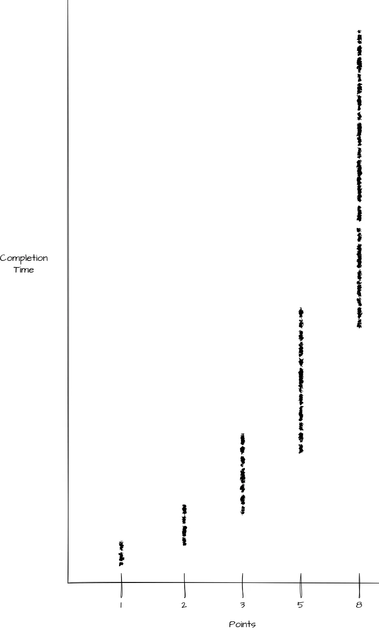
We can see this produces a nice grouping of completion times for each Point value. We can see each group is roughly twice as big and the mean is roughly two times larger than the previous point value. This would be a common spread but ultimately the exact relationships would depend on the team. The key piece of information here is our numerical Points represent categorical data.
What does this tell us about Points?
I think this visualization of points for a given team is very valuable but I rarely see it. I actually initially found it in an add-on for Jira - it’s not one of Jira’s built-in graphs. It tells us a lot about how the team values tasks against each other - relative sizing. We can take it further though.
Crucially, this scatter plot shows that the Point values are acting as distinct categories (1, 2, 3, 5, 8) that possess a wide, unique range of completion times. They are not points on a smooth, predictable quantitative line.
To isolate the inherent uncertainty within each size category, we can normalize the data: If we adjust the scatter plot, aligning the mean completion time for each point value to a horizontal center line, the Y-axis now represents the variance or uncertainty.
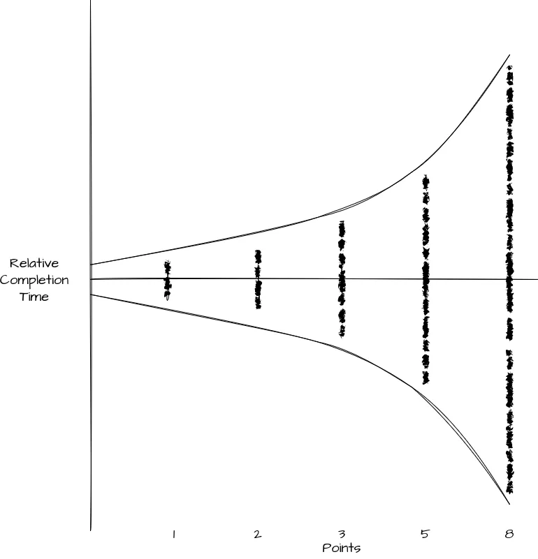
You may already see where I’m going with this from the curves I’ve added to the graph. This is the Cone of Uncertainty commonly referenced when discussing estimation for projects. At a high level, the Cone of Uncertainty is a common visualization of how accurate our estimate can be relative to the work completed and the information we have. In other words, the more information we have, the more accurate we can be and the more of a project we have completed, the more information we have.
We can see in this graph, that large Stories will take longer, we’ll have less information, and the variance on completion time is wider. The smaller the story, the more information we have (or less is needed), the narrower the window of completion time is. Thus we can take the relative sizing of Points and use it to see the level of complexity for a given story.
Conclusion: Embracing Uncertainty with Categorical Points
The confusion surrounding Story Points stems from a simple mismatch: we use a qualitative tool (relative sizing) for a quantitative task (time prediction). By forcing categorical labels (1, 2, 3, 5, 8) into numerical slots to calculate Velocity, we lose sight of their true nature.
The solution is to use historical data to reclaim the true nature of points as relative categories of complexity and variance. By plotting your team’s historical Points against actual Completion Time, you create a powerful visualization that bypasses the flawed notion of points as linear time units. Instead of trying to force every 5-point story into a narrow time box, the resulting scatter plot reveals the authentic, size-dependent variance inherent in your team’s work.
This variance is your size-specific Cone of Uncertainty.
Stop treating a 5-point story as a fixed unit of time. Start using this historical scatter data to set realistic range-based expectations for every size category. Encourage your stakeholders and product owners to discuss the range of possible completion times when reviewing estimates for larger items, acknowledging that a 3-point story is inherently less certain than a 1-point story. By recognizing points as categorical buckets of uncertainty, you can finally use them as the honest and valuable estimation tool they were always intended to be.